

Case Study: Mobile-First Changes That Improved Rankings in SA
A Johannesburg-based service business came to us with a common problem. Their website looked fine on desktop, but mobile users struggled. Pages loaded slowly, service content was hidden behind accordions, and contact buttons were hard to tap.
After a mobile-first rebuild:
- Mobile load time dropped from 6.1 seconds to 2.4 seconds
- Core service pages reached first-page rankings within 8 weeks
- Mobile enquiries increased by 38 percent
The changes were simple. We improved speed, made content fully visible on mobile, and reduced friction for users.
What Mobile-First Really Means for Google
Google Uses Your Mobile Site to Rank You
Google treats your mobile site as the main version for crawling, indexing, and ranking. If your mobile experience is weaker than desktop, your rankings are limited.
This includes:
- page content
- internal links
- metadata
- structured data
- performance
If Google can’t access or render it on mobile, it carries less weight.
Content Must Be the Same on Mobile and Desktop
Many South African sites still shorten mobile pages to keep them clean. That often causes ranking drops.
Your mobile pages should include:
- full service descriptions
- FAQs
- internal links
- headings
- trust signals such as reviews and credentials
Design can differ. Content should not.
Why Mobile-First Matters More in South Africa
Most Searches Happen on Mobile
South Africans primarily search on mobile devices, often using mobile data instead of fibre. That makes fast loading and simple layouts essential.
A site that performs well on WiFi can struggle badly on mobile data.
Slow Mobile Sites Lose Trust Quickly
If a page loads slowly, jumps around, or hides important information, users leave. That results in fewer calls, fewer form submissions, and weaker local rankings.
Real Examples of Mobile-First Websites Done Right
Takealot
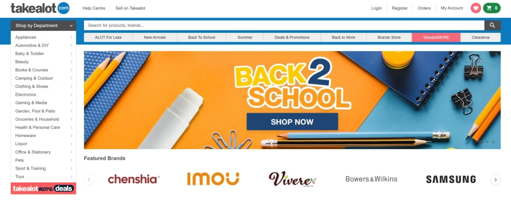
Why it works:
- fast mobile load times
- clear product hierarchy
- large, thumb-friendly buttons
- minimal popups
Takealot performs well because everything important is immediately accessible on mobile. Nothing essential is hidden.
Discovery South Africa
URL: https://www.discovery.co.za
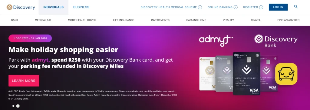
Why it works:
- consistent content between desktop and mobile
- readable text without zooming
- clear navigation and CTAs
- strong trust signals visible on mobile
Despite being content-heavy, Discovery keeps mobile pages structured and accessible.
Checkers Sixty60
URL: https://www.checkers.co.za
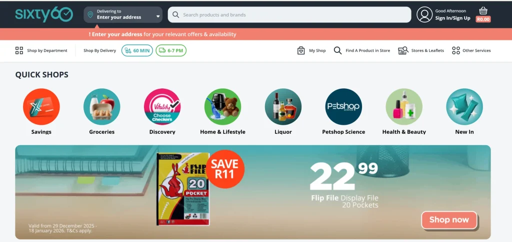
Why it works:
- simple mobile navigation
- fast page transitions
- clear calls to action
- minimal layout shifts
The site is built for users who want quick actions, which aligns perfectly with mobile-first SEO principles.
Apple (Global Benchmark)
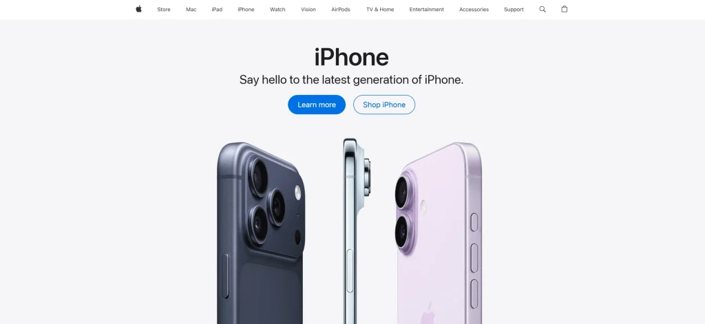
Why it works:
- excellent mobile performance
- clean layout with full content visibility
- no intrusive popups
- consistent metadata and structure
Apple is often used as a benchmark because its mobile and desktop experiences are equally complete.
GOV.UK (Global Authority Example)
URL: https://www.gov.uk
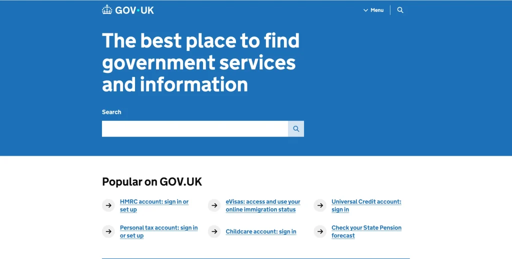
Why it works:
- extremely fast on mobile
- plain, readable content
- no unnecessary scripts
- perfect content parity
This site consistently scores high in mobile usability and accessibility, which supports strong organic visibility.
Mobile SEO Factors That Drive Rankings
Speed and Core Web Vitals
On mobile, performance matters more than visual effects.
Focus on:
- fast loading above the fold
- stable layouts with no shifting
- quick response when users tap or scroll
Most gains come from fixing images, reducing scripts, and simplifying layouts.
Mobile Crawlability and Rendering
Google crawls your site using a smartphone bot. Rankings drop when content can’t be rendered.
Common issues:
- blocked JavaScript or CSS
- lazy-loaded content that never appears
- popups covering main content
- mobile layouts that hide text
Mobile-First Checklist for South African Businesses
Optimise Your Key Pages First
Start with:
- homepage
- main service pages
- location pages
- contact page
Each page should include:
- visible service information
- a clear phone or WhatsApp CTA
- internal links to related services
- readable headings
Reduce Friction for Mobile Users
Make sure:
- buttons are easy to tap
- forms are short
- phone numbers are clickable
- menus don’t block content
Good mobile UX improves both conversions and SEO performance.
EEAT: How Mobile-First Builds Trust and Authority
Experience Signals
A mobile-first site shows you understand how users interact with your business. Clear CTAs and fast pages reflect real-world experience.
Expertise Signals
Complete content on mobile helps Google understand your services clearly and supports topical relevance.
Authority and Trust Signals
When users stay longer and interact easily, your site builds credibility. Reviews, credentials, and contact details should always be visible on mobile.
Frequently Asked Questions: Mobile-First SEO in South Africa
What Is Mobile-First Indexing?
Google mainly uses the mobile version of your website to crawl, index, and rank pages.
Can a Desktop-First Website Still Rank?
Yes, but rankings are limited if the mobile version is slower or missing content.
Does Responsive Design Mean My Site Is Mobile-First?
No. Responsive layout helps, but speed, content visibility, and crawlability still matter.
What Is the Fastest Mobile SEO Improvement?
Improve mobile speed and ensure the mobile version includes the same content as desktop.
How Can I Check My Mobile SEO Performance?
Use Google Search Console and PageSpeed Insights. Always review mobile reports.
Is Mobile-First SEO Important for Local Businesses?
Yes. Most local searches in South Africa happen on mobile with high intent to call or visit.